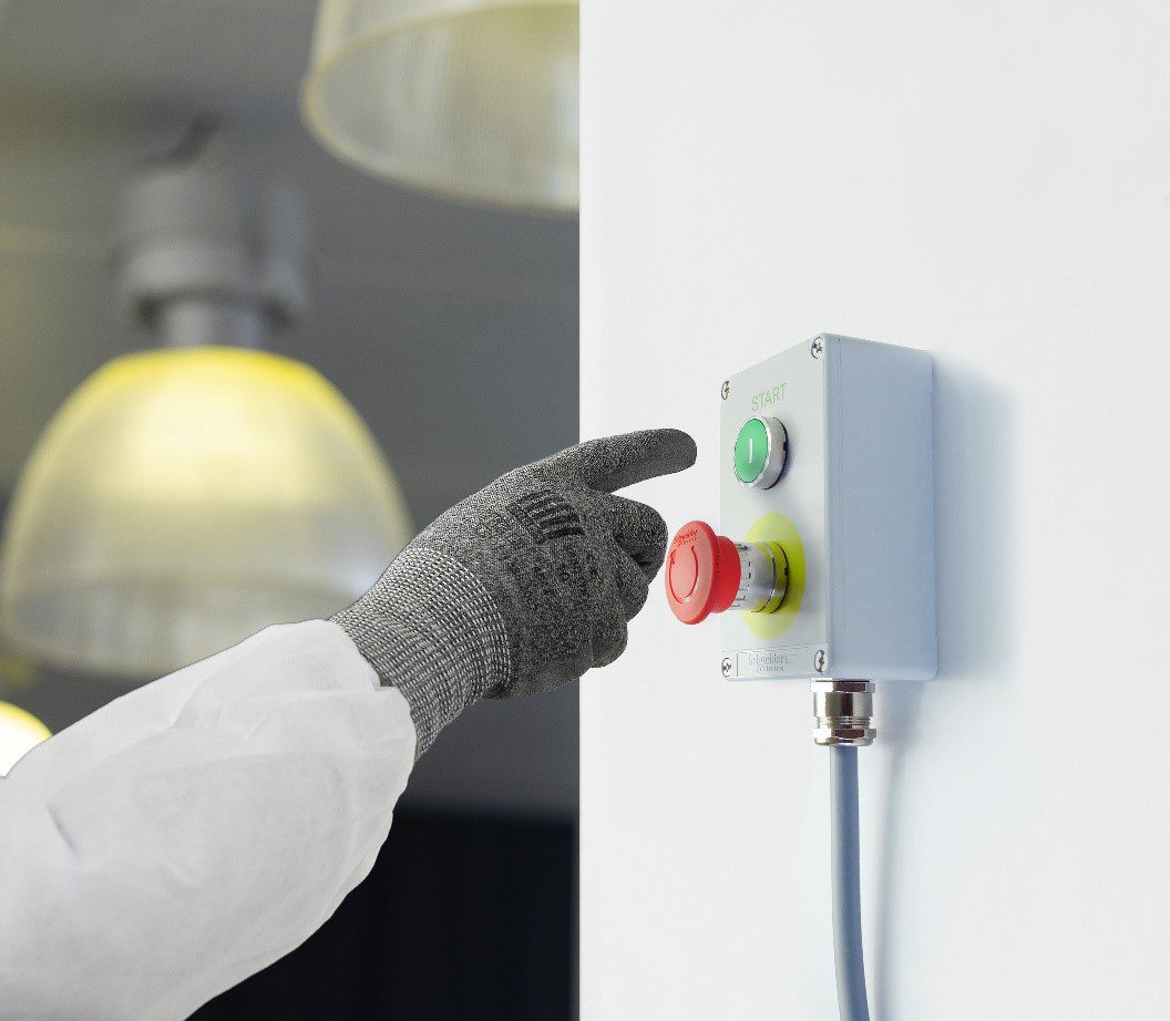
During a customer visit campaign, I had the opportunity to speak with a Machinery OEM who explained to me that he was satisfied with our actual range of metal enclosures due to its level of robustness. Nevertheless, he surprised me saying that he was repainting all the boxes that he was receiving from us because he was not too fond of our blue color inherited from our former brand image. I was imagining several pain points that it could bring me up, but his first trouble was integration and ergonomics to the point of spending extra time and money for each product purchased. This motivation which merged with the trend taken by our pushbuttons ranges these last years pushed me then to extend this work to control stations.
A simple analogy that will immediately speak to everyone to understand the importance of the aesthetics of a control panel remains to look at the evolution of cell phone design over time. Cell phone manufacturer put a lot of effort in the cosmetic of their products. This modern vision of beauty results in simplification, cleaning and maximum pare down.

To be intuitive, a product needs to be visually light and the Industry world is not spared by rational evolution of aesthetics. Machines operators also deserve to enjoy attractive environment because when you think about it, their control panel is the part of the machine they look at the most during the day.
Pleasing to the eyes is, of course, not the only aim. An improved perception of integration with the complete machine design can help to increase the operator’s performance level in many aspects.
Sometimes, integration simply means incorporation together with a machine or a batch of machines in a complete factory. And for many reasons (aluminum section structures, sheet steel careening…) an industrial environment is grey, and RAL 7035 color code is the most standard color in the world of enclosures and metal boxes.
Having a neutral background color such as grey will also allow each functions and colored pushbuttons to be emphasized and better interpreted in case of vision default.
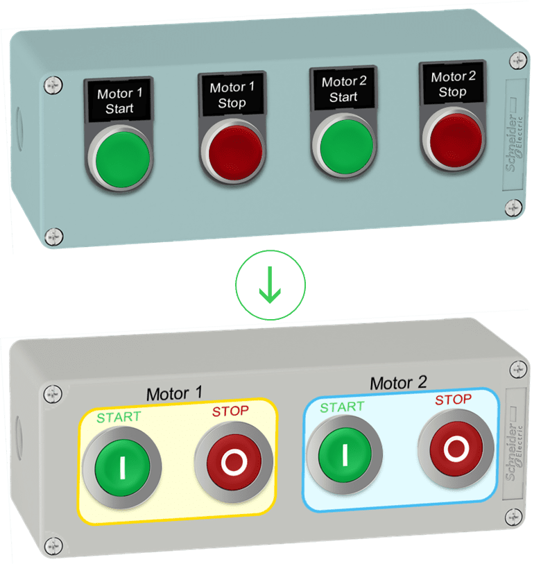
Sometimes, integration is on the control panel itself. Being able to add any marking where you need it is a great ergonomic breakthrough for your efficiency. Most of the time, as the surface of the pushbutton is usually too small to be able to display the information you want, it is preferable to use symbols that are quickly recognizable by the operators and which will be a complement to eventual texts. A customized marking is therefore preferable around the button. Such marking can provide clear and easy-to-understand instructions for machine operators, thus increasing their performance level. If an OEM manufactures machines for several countries, he can adapt his marking with the language(s) from each country.
The advantage of being able to write on a legend panel all around the pushbuttons is that there is latitude in the location of the instructions. You can group the text and avoid repetition: the less text you must read, the more intuitive the interface will be to read. It is also recommended to use large font sizes or capital letters together with a decent contrast between text and background for better readability. You can as well keep in mind that the control panel is the best place to put a company logo because that’s where everyone will tend to look.
Finally, a color code on the box for each action to be performed will also make it easier to read and more efficient for the user.
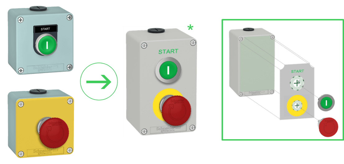
And sometimes, integration can help you to literally save money. According to IEC 60947-5-5 & ISO 13-850 standards, emergency stop buttons with trigger action, latching and positive opening contacts must be use with a yellow background. If your application requires an emergency stop button to coexist with one or more standard functions controlled by push buttons or selector switches, you will be forced to install a dedicated yellow box in order to meet the normative requirement. With the capacity to customize the front panel of the boxes, it becomes possible to install different functions together. Then, advantages become interesting: only one box to buy, less bulk, reduced wiring and installation time.

*Example of what the customization tool offers on Schneider Electric website
Packaging or process machinery applications are now following aesthetics encouraged by the sanitary cleaning in Food & Beverages applications. An enclosure embedding flush mounted pushbuttons will be easier to clean and will be cleaned less often due to a lower accumulation of dust. It makes even more sense for metal control stations which are meant for harsh environment or mobile applications: a pushbutton that does not protrude from a panel will be less likely to bump into an external element and you will certainly improve your machine robustness against shocks.
Speaking of the advantage of metal, the perception of robustness that it provides is comforting for the end user who does not have the feeling that the form has prevailed over the content because, fundamentally, the reliability of an installation to guarantee the safety of the men and women who use it must remain the highest priority.

An implementation of few tips provided in this article could lead from the upper enclosure to the lower one
For readers interested in our new XAPD/K metal control station range which gathers all these assets, you can discover it on www.schneider-electric.com/control


