Question: What do witches and vampires have in common with industrial machinery? Answer: They’ve all undergone serious makeovers that have transformed them from ugly ducklings to graceful swans. The wart-covered noses and sharp fangs of our childhood fairytales have been replaced by the beautiful specimens that populate today’s television and movies (think Charmed or the Twilight movies). Show business understood that an aesthetic facelift would make their monsters more appealing and popular with a broader audience.
By the same token, industrial machinery has also undergone an aesthetic evolution that has moved design from an afterthought to a key element in product development. I meet more and more machine manufacturers these days who prioritize design, using design consultants or even maintaining their own dedicated design teams in charge of the look and feel of their products.
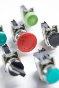
In previous blogs, I’ve discussed ways that we can make machines more attractive (How Can Aesthetics Drastically Improve Your Machine Efficiency?), and why it’s important for machine manufacturers to follow this trend (How important is aesthetics for your machine?). Today, I’d like to take a closer look at the history of one of the main aesthetic trends in the market: the flush mounting of panel mounted products like push-buttons. This might not appear to be a monumental shift but as the images below clearly illustrate, the impact of the new design is a significant and positive one.
The trend towards flush push-buttons started to appear in Asia at the beginning of the millennium when computer numerical control (CNC) machine manufacturers in Japan began to progressively replace their 16mm diameter push-button keyboards with membrane keyboards. The flat ergonomics and easy installation of the plastic sheet interface better suited their requirements for a large-sized complex interface. On the other hand, it was also important to them to keep the haptic (or tactile) ergonomics of a “real” push-button for key functions like powering down the machine. They began to work on integrating the membrane interface and the traditional push-buttons. This resulted in the flush mounting solution.
Following the lead of Japanese push-button manufacturers, other Asian manufacturers soon launched their own flush solutions and the trend began to grow across the Asia Pacific region.
Meanwhile in Europe and the Americas, even though flatter interfaces were cropping up everywhere in our everyday lives – like the flush buttons in elevators – industrial machines seemed to remain oblivious to this aesthetic update. The new ergonomics eventually did start to appear in packaging and process machinery as a response to improved hygiene requirements for Food & Beverage applications. The flat surface was easier to clean and meant less dust accumulation so flush push-button interfaces quickly became the ideal solution for these applications.
At the same time, more complex products like touch screens and front facing power meters also became flatter as screen technology continued to evolve (and we watched our televisions get slimmer…). The flush aesthetics, with their advantages in environments like the Food industry and supported by the latest products, are now becoming the standard for all types of machines.
To find out more about Schneider Electric’s flush solutions, I invite you to discover our Harmony range.
Related articles :


